The Quagmire Challenge: Dynamic Dashboards (September 2018)
The Question
Excel is not only a great tool for data manipulation but also for charting. Most of the time we insert these charts into PowerPoint presentations or as pdf reports to our clients, colleagues and superiors. However, sometimes we want to create user friendly “dashboards” to help us with decision making.
In this challenge, your task is to create a dynamic chart for a dashboard to quickly see the minimum and maximum weekly sales volume in a given period. Below is a demo of the final product:
We have provided you with a simple line chart of the sales volume over 22 weeks. The final chart should allow the user to move the highlighted green region by using the “spinner” arrow buttons at the top left of the chart. As the highlighted region moves left or right, it should also show the minimum and maximum weekly sales over the currently highlighted region.
We have broken up the challenge in steps to get you started. Click here to download the spreadsheet with the starting data.
- Step 1 – Plotted Weeks: Using formulas, create a series in the light blue highlighted cells (column C) of True/False values to determine what weeks will be highlighted. These formulas should use the inputs from cells L10 (the width of the highlighted range) and L12 (the starting point of the highlight).
- Step 2 – Series for Highlighted Region: Create the series in columns D and E (light yellow highlighted cells) for the green line and green highlight box that will be plotted on the chart.
- Step 3 – Series for Min/Max Formulas: Create the series in column F (grey cells) that will be used for the min/max calculations in cells L17 and L18.
- Step 4 – Series for the Min/Max Label: Create series in column G and H (light orange cells) to plot the label of Min/Max sales volume on the chart. The Min/Max label should be displayed centered and on top of the highlighted green area (as depicted in the completed chart picture).
- The series in column G is used to plot the height of the label, and the series in column H to plot the text of the label.
- Step 5 – Plot all the relevant Series: Plot the data in columns D, E, G and H to add the green line, green box highlight, and green Min/Max label to the existing chart.
Have fun and good luck. This is easily our toughest challenge yet. If you can successfully “chart” the correct path to the solution, there will be an extra special prize announced in November for the lucky winner. Submit your answer to info@marqueegroup.ca, subject: Quagmire #9.
The Solution
It was once again difficult to pick a winner for the challenge as we received many excellent solutions. However, as promised, the prize for this month was extra special and we had to choose only one winner.
In this challenge, we asked participants to chart a dynamic highlighted range on top of a line chart that showed the maximum and minimum data points within the given period. We considered the best solution to meet the following criteria:
- The highlighted range had to dynamically move as the spinner button was pressed
- The max/min label had to be centered above the highlighted region
- Bonus points if the max/min label was just one data point instead of an entire line or two scatter plots
- The max/min label had to work for different time ranges (default was set to 3 weeks; however, it should still work for 5, 7, etc. weeks)
- Bonus points for formatting:
- The highlighted region should be semi-transparent just like in the solution picture (so that the gridlines behind the chart still show up)
- The line chart should still intersect the y-axis after highlighted region is plotted
Below is the solution following the same steps provided in the challenge. It begins by preparing the various data series needed to build the chart.
Step 1 – Plotted Weeks
- The formula to use to determine what weeks will be highlighted is the following (to be entered in cell C4 and copied down):
=AND(A4>=$L$12,A4<($L$12+$L$10))
- An IF statement was not required here as the AND formula will itself return a TRUE or FALSE
- This formula will return a TRUE if the week number in column A is within the Start Interval and the Highlight Range period
Step 2 – Series for Highlighted Region
- In order to plot the darker blue line chart and highlight region only for the corresponding weeks, one had to pull in the Sales Volume numbers only for the corresponding rows that have a TRUE in column C and an “NA” error for all the rows that have a FALSE
- The NA error “tricks” Excel into not plotting those data points on the chart
- The formula to be used in column D is: =IF(C4,B4,NA())
- The formula be used in column E is: =IF(C4,$L$8,NA()), where L8 was the pre-calculated value of the Bar Height
Step 3 – Series for Min/Max Formulas
- Column F was only used to retrieve the corresponding numbers for the Min and Max labels for the highlighted region
- Because column D had NA errors in it, a Max or Min formula on the range in that column would have returned an error as well
- The formula to be used in column F is: =IFERROR(D4,””)
- The IFERROR formula will return the first part of the formula if there is no error, otherwise the second part if there is (in this case returning a blank for rows with NA() in column D)
Step 4 – Series for the Min/Max Label:
- There were multiple viable solutions for this part of the challenge
- Our proposed solution was to plot a line series on the secondary axis that had NA() errors for all weeks except for one data point
- That one data point would be the middle point of the highlighted range and have a custom data label
- Alternatively, a single scatter point with a custom data label could be used as well
- In either solution, there were two intricacies with this step:
- Determining which week to plot the data label so that it would always be in the middle of the range
- Creating one data label with the max and min text on two separate lines
- In column G, the following formula was used to create the height of the data label, and also plot the label only for the week in the middle of the highlighted range (by using NA() again for all other weeks):
=IF(A4=$L$12+ROUNDDOWN($L$10/2,0),E4,NA())
- In column H, the following formulas was used for the labels, where M18 is the location of the max label, M17 the location of the min label, and the CHAR(10) is the special character to create a new line (a line break):
=IF(G4>0,$M$18&CHAR(10)&$M$17,NA())
Step 5 – Plot all the relevant Series
- The darker blue line was created by adding the data in Column D as a new line series
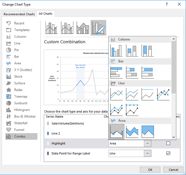
- The highlighted region was created by adding the data in Column E as a new series and changing the series chart type to the first option under Area:

- Lastly, the data label was a line series plotted on the secondary axis by using Column G as the series values and Column H as the x-axis labels (Horizontal axis)
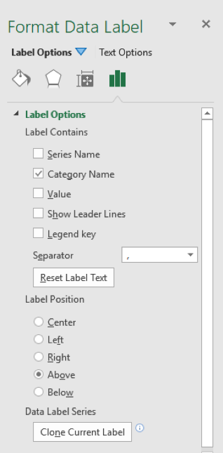
- Data labels were then added for this series and in the Format Data Labels window the following settings were selected:
- Label contains: Category Name
- Label position: Above

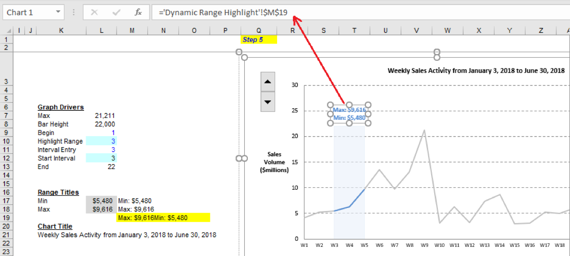
- The alternative to this last data series was to plot one scatter point with the following formulas used to create the coordinates:
- Series X values: =L12+(L10-1)/2, where L12 is the start interval for the highlight range and L10 is the width in weeks of the highlight range
- Series Y values: =E9, where E9 is the height of the highlight bar
- Once the scatter point is plotted, a data label can be added and linked to a cell in Excel that contains the concatenated label
- In the screenshot below the label is linked to cell M19 by clicking on the label, pressing F2 (to go to the formula bar), writing “=” and then clicking on the cell M19 to link it up
- The formula used in cell M19 to concatenate the max and min labels is similar to the one used in column H for Step 4: =M18&CHAR(10)&M17